Northeast Tomato
Juicy, by design
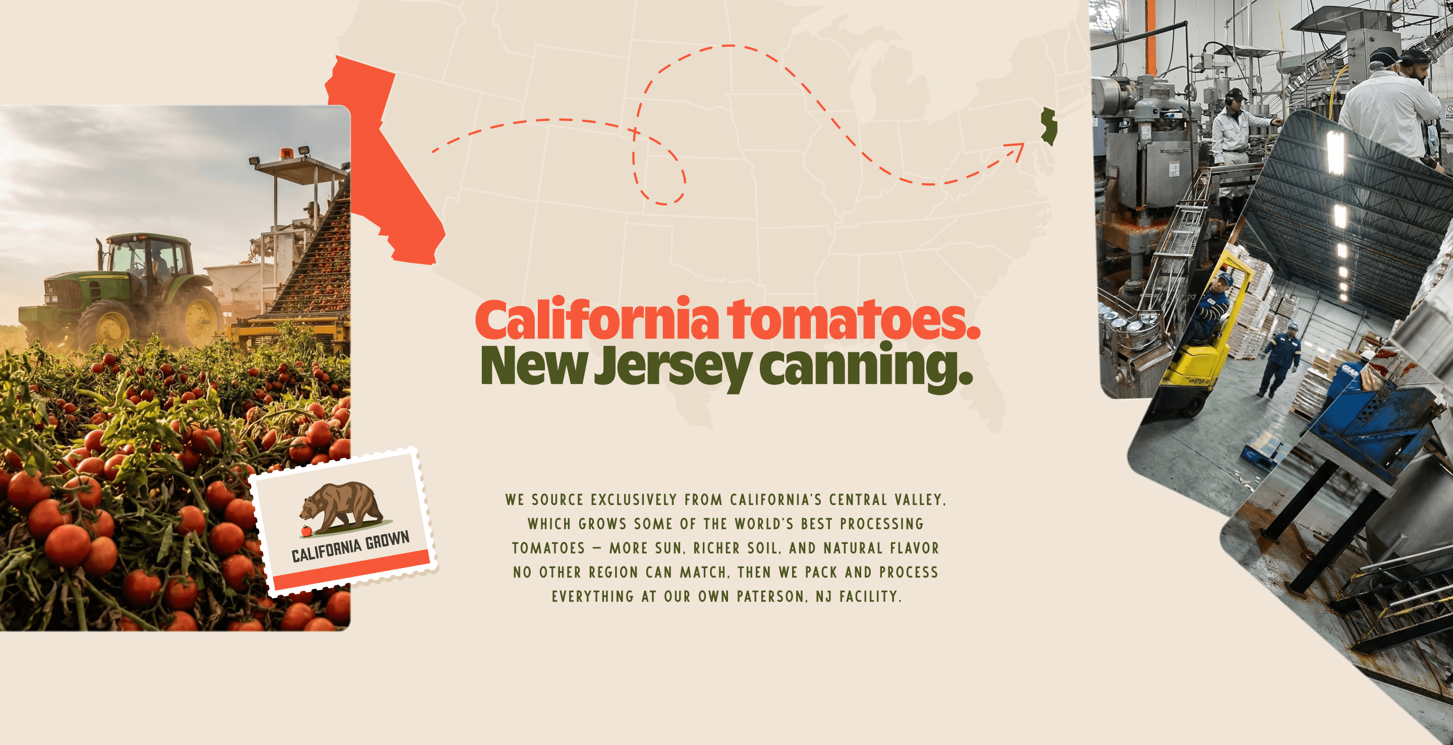
Northeast Tomato has been canning California-grown tomatoes since 1989, turning out hundreds of thousands of cans a day of ketchup, sauce, juice, and whole peeled tomatoes. Most of it ships under other people's labels, to grocery brands, institutional buyers, and government food programs.
Their old website told none of that story, so they asked us for one that did.
Most factories in this space present themselves like factories: stainless steel, hairnets, spec sheets.
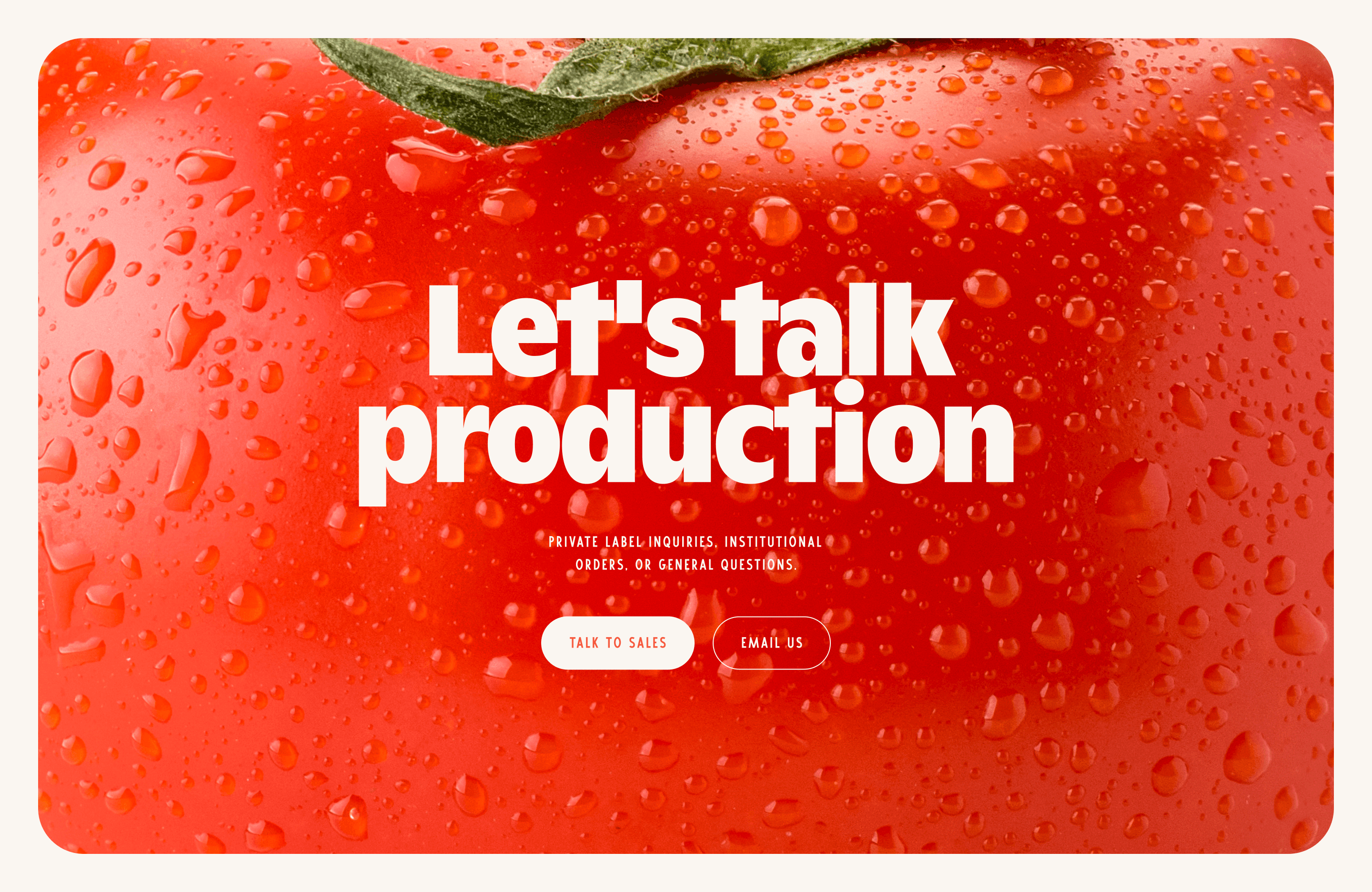
We went the other way and designed a site that looks like food.
The visual language takes its cues from California, with details tucked throughout: a "California Grown" postage stamp starring the state bear, and a map tracing the journey from Central Valley fields to the New Jersey canning line. Everything is plump, rounded, and juicy, down to the dew on the hero tomato, and soft animation keeps the whole thing feeling fresh.
Buyers land on one clear invitation: let's talk production.
Design by D7mtg. Development by Incroy